ShopDreamUp AI ArtDreamUp
Deviation Actions
Daily Deviation
Daily Deviation
June 24, 2010
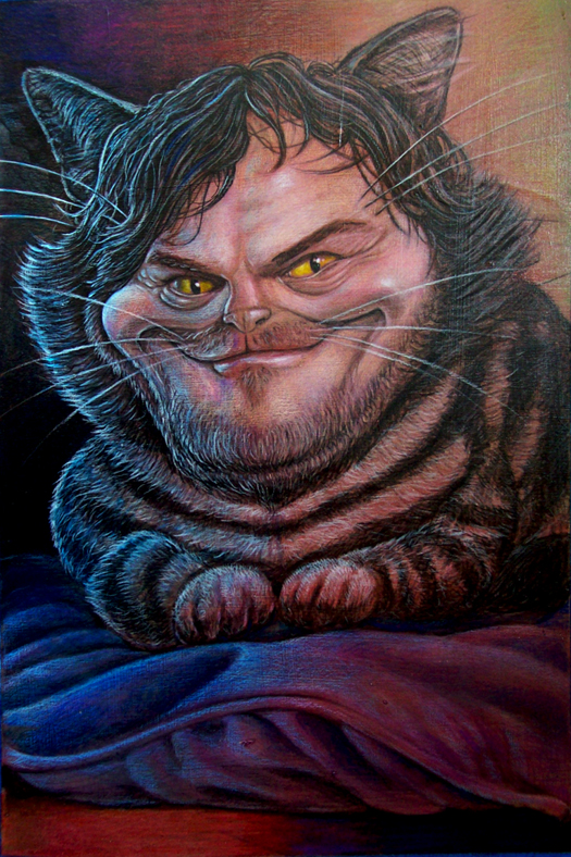
The sublime beauty of Jack Black Cat by *ThomasKain takes my breath away!
Featured by Stykera


Description
This was called the "famous person as an animal" project. I ran across this photo: [link] while searching for a good celebrity to morph into an animal and just felt the man had a very cheshire cat look about him.
Acrylics and colored pencil on illustration board. 9" by 13.5".
Acrylics and colored pencil on illustration board. 9" by 13.5".
Image size
525x788px 490.68 KB
Make
EASTMAN KODAK COMPANY
Model
KODAK EASYSHARE C613 ZOOM DIGITAL CAMERA
Shutter Speed
1/8 second
Aperture
F/3.0
Focal Length
8 mm
ISO Speed
200
Date Taken
Mar 7, 2007, 6:58:43 PM
© 2010 - 2024 ThomasKain
Comments1205
Join the community to add your comment. Already a deviant? Log In
I see your jack black cat, and i raise you one, jack nicholson-alisa.
:origin()/pre00/1e1c/th/pre/i/2017/237/e/b/heeeeere_s_mmmona_by_gravityx9-d2ob5tx.jpg)